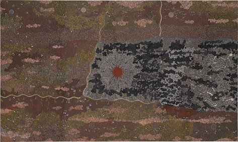
The artist utilized synthetic polymer paint on canvas. An element demonstrated in this painting is directional line to lead the viewers eye to the focal point of the red dot in the center of the painting. He also uses pointillism as he painted little dots with different colors to create saturation and texture within the painting. Lastly, the use of color is seen as he brought the attention of the artwork to the center circle by using a highly saturated red color which is surrounded by dull unsaturated colors.
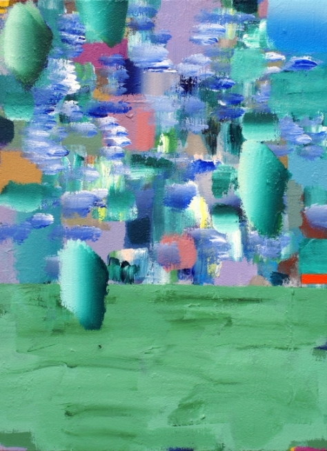
The artist used acrylic on canvas. She uses abstract drawings and shapes to create an illusion of a daydream. Also her use in analogous cool, colors with the blues and greens create a calm effect to the viewer. Lastly, the darker shades of green and blue shapes give depth to the picture and abstract scene. You get a sense of the the circles floating and there being a landscape.
The artist uses oil on canvas. This artwork is an example of how an artist can create an illusion of motion. The composition of the circular objects being repeated and going all in a certain direction gives the viewer a sense of motion. Also the element of directional line is used as there are lines from different angles all pointing towards the focal point with the greatest value. Lastly, geometric shapes of triangles and rectangles are used to bring attention to the viewer to that specific area. In the foreground is a car and the motion being portrayed is of a car so the triangles bring your eyes to the focal point of the car.
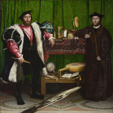
The artist used oil on oak for this painting. The element of complimentary colors is used greatly in this painting as the green background and the red coats on the two men create the men to stand out in the picture. Also the element of distorted scale is portrayed as a distorted image of a skull is slashed out across the foreground. This is also symbolism to link and divide the two friends. The artists as uses complimentary color and hierarchical scale to bring the viewers eye toward the man on the left and create more emphasis of importance to him.
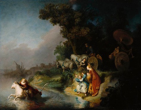
The artist for this painting used oil on a single oak panel. The artist creates a focal point where our eyes are drawn to the two women along the edge of the water. He does so with the use of contrast and how the two subjects are surrounded by the dark values of the woods and then as your eye goes from the two woman to the person on the horse the value gets lighter. Also, color is used to create the focal point as the lady is wearing a red coat and surrounding her is green grass and dark woods. Depth is also created in the foreground of the woods by the dark values of greens.
Vincent uses a quill and pen with different colors. The hatching creates different variations of value. Also his use of colors make the painting very lively. The direction of the lines creates an illusion and sense of motion as the lady walks along the path towards the house. Lastly, a sense of motion is seen in the clouds as the lines are circular and make it look like the clouds are moving and in action.
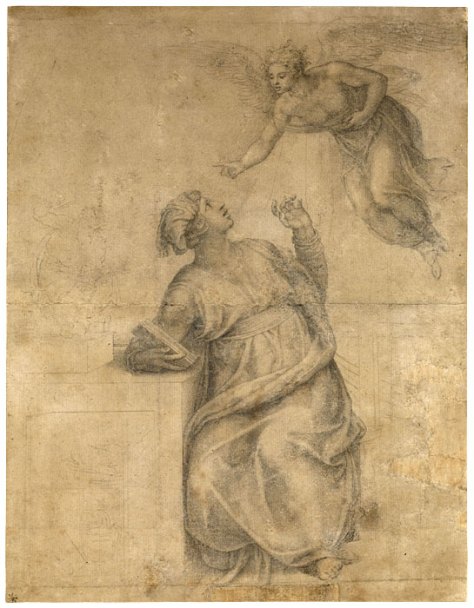
The medium of this drawing is black chalk. He uses the principle of cross-hatching to create depth and value in the drawing. Also, a focal point is created and your eyes are drown to the two figures as they are drawn with greatest value. Also, he uses implied line to bring your attention from the angel, down his arm to the virgin.
The medium of the painting is oil on canvas. The artist uses pointillism as it is relied heavily on small dots of color. This optical mixing of different colored dots creates a more lively scene of the beach as the colors are more intense with their individual saturation. Lastly, he uses the principle of complementary colors of orange, purple, and green and primary colors of red, blue, and yellow to create the lively scenery and saturation.
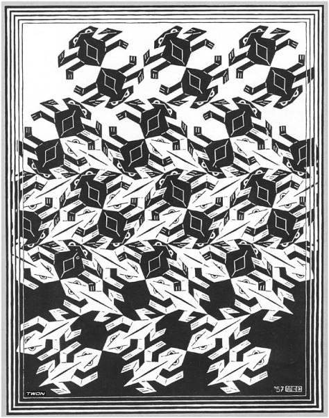
This artist used woodcut and is an example of tessellation. The technique of figure-ground reversal is used which creates change in the background from black to white. Also, positive and negative shapes are portrayed and give the figures shape and form. Lastly, he uses rhythm of geometric shapes to allow your eyes to follow the reversal and pattern easily.
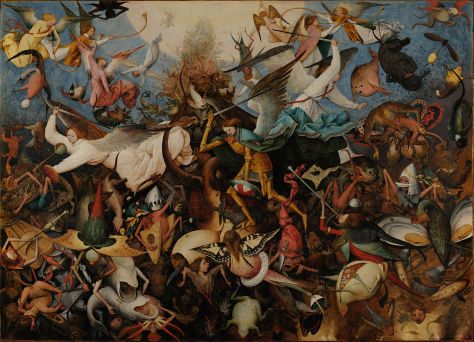
Medium: painting on oak. The artist creates a pattern of angels in this painting to give a sense of devastation and chaos in the painting. Also the use of color with the dark reds, and browns create an effect to the viewer of trouble and hurt. The focal point of the painting is created using highlight of the two white angels as the white stands out and contrasts the rest of the painting.